先决条件: 创建并写入excel文件。
XlsxWriter 是一个Python库,使用它可以对excel文件执行多种操作,如创建、写入、算术操作和绘制图形。让我们看看如何使用实时数据绘制不同类型的散点图。 图表由至少一系列的一个或多个数据点组成。系列本身由单元格范围的引用组成。
用于在excel表格上绘制图表, 首先,创建特定图表类型的图表对象(如散点等)。创建图表对象后,在其中插入数据,最后将该图表对象添加到图纸对象中。
代码#1: 绘制简单的散点图。
要在excel工作表上绘制简单散点图,请使用add_chart()方法,并键入工作簿对象的“Scatter”关键字参数。
# import xlsxwriter module import xlsxwriter # Workbook() takes one, non-optional, argument # which is the filename that we want to create. workbook = xlsxwriter.Workbook( 'chart_scatter.xlsx' ) # The workbook object is then used to add new # worksheet via the add_worksheet() method. worksheet = workbook.add_worksheet() # Create a new Format object to formats cells # in worksheets using add_format() method . # here we create bold format object . bold = workbook.add_format({ 'bold' : 1 }) # create a data list . headings = [ 'Number' , 'Batch 1' , 'Batch 2' ] data = [ [ 2 , 3 , 4 , 5 , 6 , 7 ], [ 80 , 80 , 100 , 60 , 50 , 100 ], [ 60 , 50 , 60 , 20 , 10 , 20 ], ] # Write a row of data starting from 'A1' # with bold format . worksheet.write_row( 'A1' , headings, bold) # Write a column of data starting from # 'A2', 'B2', 'C2' respectively . worksheet.write_column( 'A2' , data[ 0 ]) worksheet.write_column( 'B2' , data[ 1 ]) worksheet.write_column( 'C2' , data[ 2 ]) # Create a chart object that can be added # to a worksheet using add_chart() method. # here we create a scatter chart object . chart1 = workbook.add_chart({ 'type' : 'scatter' }) # Add a data series to a chart # using add_series method. # Configure the first series. # = Sheet1 !$A$1 is equivalent to ['Sheet1', 0, 0]. # note : spaces is not inserted in b / w # = and Sheet1, Sheet1 and ! # if space is inserted it throws warning. chart1.add_series({ 'name' : '= Sheet1 !$B$1' , 'categories' : '= Sheet1 !$A$2:$A$7' , 'values' : '= Sheet1 !$B$2:$B$7' , }) # Configure a second series. # Note use of alternative syntax to define ranges. # [sheetname, first_row, first_col, last_row, last_col]. chart1.add_series({ 'name' : [ 'Sheet1' , 0 , 2 ], 'categories' : [ 'Sheet1' , 1 , 0 , 6 , 0 ], 'values' : [ 'Sheet1' , 1 , 2 , 6 , 2 ], }) # Add a chart title chart1.set_title ({ 'name' : 'Results of data analysis' }) # Add x-axis label chart1.set_x_axis({ 'name' : 'Test number' }) # Add y-axis label chart1.set_y_axis({ 'name' : 'Data length (mm)' }) # Set an Excel chart style. chart1.set_style( 11 ) # add chart to the worksheet # the top-left corner of a chart # is anchored to cell E2 . worksheet.insert_chart( 'E2' , chart1) # Finally, close the Excel file # via the close() method. workbook.close() |
输出: 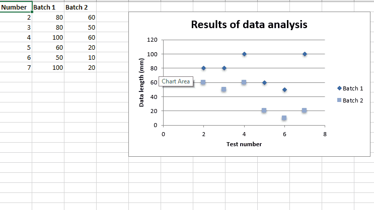 代码#2: 用直线和标记绘制散点图子类型。
要在excel工作表上打印这种类型的图表,请使用带有工作簿对象的“scatter”类型和子类型“straight_with_markers”关键字参数的add_chart()方法。
# import xlsxwriter module import xlsxwriter # Workbook() takes one, non-optional, argument # which is the filename that we want to create. workbook = xlsxwriter.Workbook( 'chart_scatter2.xlsx' ) # The workbook object is then used to add new # worksheet via the add_worksheet() method. worksheet = workbook.add_worksheet() # Create a new Format object to formats cells # in worksheets using add_format() method . # here we create bold format object . bold = workbook.add_format({ 'bold' : 1 }) # create a data list . headings = [ 'Number' , 'Batch 1' , 'Batch 2' ] data = [ [ 2 , 3 , 4 , 5 , 6 , 7 ], [ 80 , 80 , 100 , 60 , 50 , 100 ], [ 60 , 50 , 60 , 20 , 10 , 20 ], ] # Write a row of data starting from 'A1' # with bold format . worksheet.write_row( 'A1' , headings, bold) # Write a column of data starting from # 'A2', 'B2', 'C2' respectively . worksheet.write_column( 'A2' , data[ 0 ]) worksheet.write_column( 'B2' , data[ 1 ]) worksheet.write_column( 'C2' , data[ 2 ]) # Create a chart object that can be added # to a worksheet using add_chart() method. # here we create a Scatter chart sub-type with # straight lines and markers object . chart1 = workbook.add_chart({ 'type' : 'scatter' , 'subtype' : 'straight_with_markers' }) # Add a data series to a chart # using add_series method. # Configure the first series. # = Sheet1 !$A$1 is equivalent to ['Sheet1', 0, 0]. chart1.add_series({ 'name' : '= Sheet1 !$B$1' , 'categories' : '= Sheet1 !$A$2:$A$7' , 'values' : '= Sheet1 !$B$2:$B$7' , }) # Configure a second series. # Note use of alternative syntax to define ranges. # [sheetname, first_row, first_col, last_row, last_col]. chart1.add_series({ 'name' : [ 'Sheet1' , 0 , 2 ], 'categories' : [ 'Sheet1' , 1 , 0 , 6 , 0 ], 'values' : [ 'Sheet1' , 1 , 2 , 6 , 2 ], }) # Add a chart title chart1.set_title ({ 'name' : 'Results of data analysis' }) # Add x-axis label chart1.set_x_axis({ 'name' : 'Test number' }) # Add y-axis label chart1.set_y_axis({ 'name' : 'Data length (mm)' }) # Set an Excel chart style. chart1.set_style( 11 ) # add chart to the worksheet # the top-left corner of a chart # is anchored to cell E2 . worksheet.insert_chart( 'E2' , chart1) # Finally, close the Excel file # via the close() method. workbook.close() |
输出: 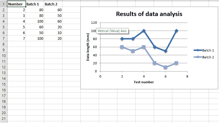 代码#3: 绘制带有直线且无标记的散点图子类型。
要在excel工作表上打印这种类型的图表,请使用带有工作簿对象的类型“scatter”和子类型“straight”关键字参数的add_chart()方法。
# import xlsxwriter module import xlsxwriter # Workbook() takes one, non-optional, argument # which is the filename that we want to create. workbook = xlsxwriter.Workbook( 'chart_scatter3.xlsx' ) # The workbook object is then used to add new # worksheet via the add_worksheet() method. worksheet = workbook.add_worksheet() # Create a new Format object to formats cells # in worksheets using add_format() method . # here we create bold format object . bold = workbook.add_format({ 'bold' : 1 }) # create a data list . headings = [ 'Number' , 'Batch 1' , 'Batch 2' ] data = [ [ 2 , 3 , 4 , 5 , 6 , 7 ], [ 80 , 80 , 100 , 60 , 50 , 100 ], [ 60 , 50 , 60 , 20 , 10 , 20 ], ] # Write a row of data starting from 'A1' # with bold format . worksheet.write_row( 'A1' , headings, bold) # Write a column of data starting from # 'A2', 'B2', 'C2' respectively . worksheet.write_column( 'A2' , data[ 0 ]) worksheet.write_column( 'B2' , data[ 1 ]) worksheet.write_column( 'C2' , data[ 2 ]) # Create a chart object that can be added # to a worksheet using add_chart() method. # here we create a Scatter chart sub-type with # straight lines and no markers object . chart1 = workbook.add_chart({ 'type' : 'scatter' , 'subtype' : 'straight' }) # Add a data series to a chart # using add_series method. # Configure the first series. # = Sheet1 !$A$1 is equivalent to ['Sheet1', 0, 0]. chart1.add_series({ 'name' : '= Sheet1 !$B$1' , 'categories' : '= Sheet1 !$A$2:$A$7' , 'values' : '= Sheet1 !$B$2:$B$7' , }) # Configure a second series. # Note use of alternative syntax to define ranges. # [sheetname, first_row, first_col, last_row, last_col]. chart1.add_series({ 'name' : [ 'Sheet1' , 0 , 2 ], 'categories' : [ 'Sheet1' , 1 , 0 , 6 , 0 ], 'values' : [ 'Sheet1' , 1 , 2 , 6 , 2 ], }) # Add a chart title chart1.set_title ({ 'name' : 'Results of data analysis' }) # Add x-axis label chart1.set_x_axis({ 'name' : 'Test number' }) # Add y-axis label chart1.set_y_axis({ 'name' : 'Data length (mm)' }) # Set an Excel chart style. chart1.set_style( 11 ) # add chart to the worksheet # the top-left corner of a chart # is anchored to cell E2 . worksheet.insert_chart( 'E2' , chart1) # Finally, close the Excel file # via the close() method. workbook.close() |
输出: 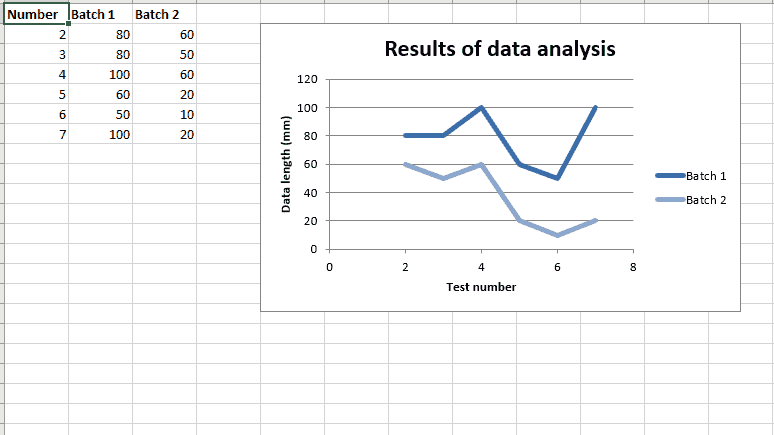 代码#4: 用平滑的线条和标记绘制散点图子类型。
要在excel工作表上打印这种类型的图表,请使用带有工作簿对象的“散布”类型和子类型“带标记的平滑”关键字参数的add_chart()方法。
# import xlsxwriter module import xlsxwriter # Workbook() takes one, non-optional, argument # which is the filename that we want to create. workbook = xlsxwriter.Workbook( 'chart_scatter4.xlsx' ) # The workbook object is then used to add new # worksheet via the add_worksheet() method. worksheet = workbook.add_worksheet() # Create a new Format object to formats cells # in worksheets using add_format() method . # here we create bold format object . bold = workbook.add_format({ 'bold' : 1 }) # create a data list . headings = [ 'Number' , 'Batch 1' , 'Batch 2' ] data = [ [ 2 , 3 , 4 , 5 , 6 , 7 ], [ 80 , 80 , 100 , 60 , 50 , 100 ], [ 60 , 50 , 60 , 20 , 10 , 20 ], ] # Write a row of data starting from 'A1' # with bold format . worksheet.write_row( 'A1' , headings, bold) # Write a column of data starting from # 'A2', 'B2', 'C2' respectively . worksheet.write_column( 'A2' , data[ 0 ]) worksheet.write_column( 'B2' , data[ 1 ]) worksheet.write_column( 'C2' , data[ 2 ]) # Create a chart object that can be added # to a worksheet using add_chart() method. # here we create a Scatter chart sub-type with # smooth lines and markers object . chart1 = workbook.add_chart({ 'type' : 'scatter' , 'subtype' : 'smooth_with_markers' }) # Add a data series to a chart # using add_series method. # Configure the first series. # = Sheet1 !$A$1 is equivalent to ['Sheet1', 0, 0]. chart1.add_series({ 'name' : '= Sheet1 !$B$1' , 'categories' : '= Sheet1 !$A$2:$A$7' , 'values' : '= Sheet1 !$B$2:$B$7' , }) # Configure a second series. # Note use of alternative syntax to define ranges. # [sheetname, first_row, first_col, last_row, last_col]. chart1.add_series({ 'name' : [ 'Sheet1' , 0 , 2 ], 'categories' : [ 'Sheet1' , 1 , 0 , 6 , 0 ], 'values' : [ 'Sheet1' , 1 , 2 , 6 , 2 ], }) # Add a chart title chart1.set_title ({ 'name' : 'Results of data analysis' }) # Add x-axis label chart1.set_x_axis({ 'name' : 'Test number' }) # Add y-axis label chart1.set_y_axis({ 'name' : 'Data length (mm)' }) # Set an Excel chart style. chart1.set_style( 11 ) # add chart to the worksheet # the top-left corner of a chart # is anchored to cell E2 . worksheet.insert_chart( 'E2' , chart1) # Finally, close the Excel file # via the close() method. workbook.close() |
输出: 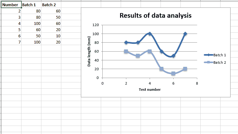 代码#5: 绘制带有平滑线条且无标记的散点图子类型。
要在excel工作表上打印这种类型的图表,请使用带有工作簿对象的类型“scatter”和子类型“smooth”关键字参数的add_chart()方法。
# import xlsxwriter module import xlsxwriter # Workbook() takes one, non-optional, argument # which is the filename that we want to create. workbook = xlsxwriter.Workbook( 'chart_scatter5.xlsx' ) # The workbook object is then used to add new # worksheet via the add_worksheet() method. worksheet = workbook.add_worksheet() # Create a new Format object to formats cells # in worksheets using add_format() method . # here we create bold format object . bold = workbook.add_format({ 'bold' : 1 }) # create a data list . headings = [ 'Number' , 'Batch 1' , 'Batch 2' ] data = [ [ 2 , 3 , 4 , 5 , 6 , 7 ], [ 80 , 80 , 100 , 60 , 50 , 100 ], [ 60 , 50 , 60 , 20 , 10 , 20 ], ] # Write a row of data starting from 'A1' # with bold format . worksheet.write_row( 'A1' , headings, bold) # Write a column of data starting from # 'A2', 'B2', 'C2' respectively . worksheet.write_column( 'A2' , data[ 0 ]) worksheet.write_column( 'B2' , data[ 1 ]) worksheet.write_column( 'C2' , data[ 2 ]) # Create a chart object that can be added # to a worksheet using add_chart() method. # here we create a Scatter chart sub-type with # smooth lines and no markers object . chart1 = workbook.add_chart({ 'type' : 'scatter' , 'subtype' : 'smooth' }) # Add a data series to a chart # using add_series method. # Configure the first series. # = Sheet1 !$A$1 is equivalent to ['Sheet1', 0, 0]. chart1.add_series({ 'name' : '= Sheet1 !$B$1' , 'categories' : '= Sheet1 !$A$2:$A$7' , 'values' : '= Sheet1 !$B$2:$B$7' , }) # Configure a second series. # Note use of alternative syntax to define ranges. # [sheetname, first_row, first_col, last_row, last_col]. chart1.add_series({ 'name' : [ 'Sheet1' , 0 , 2 ], 'categories' : [ 'Sheet1' , 1 , 0 , 6 , 0 ], 'values' : [ 'Sheet1' , 1 , 2 , 6 , 2 ], }) # Add a chart title chart1.set_title ({ 'name' : 'Results of data analysis' }) # Add x-axis label chart1.set_x_axis({ 'name' : 'Test number' }) # Add y-axis label chart1.set_y_axis({ 'name' : 'Data length (mm)' }) # Set an Excel chart style. chart1.set_style( 11 ) # add chart to the worksheet # the top-left corner of a chart # is anchored to cell E2 . worksheet.insert_chart( 'E2' , chart1) # Finally, close the Excel file # via the close() method. workbook.close() |
输出: 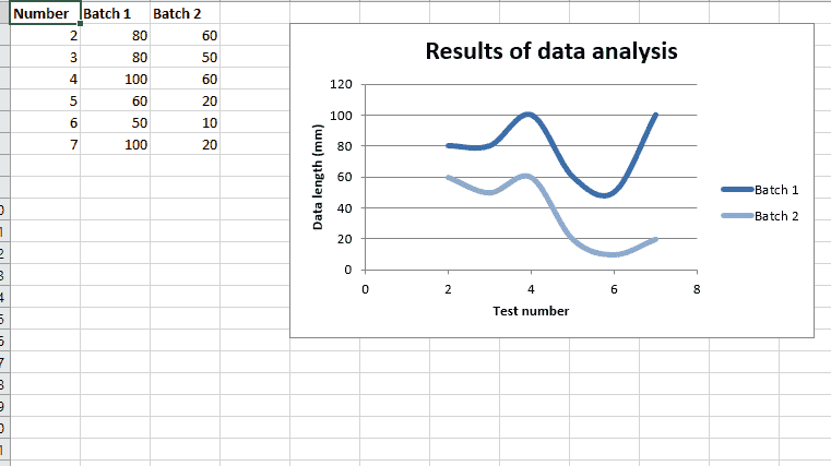

![关于”PostgreSQL错误:关系[表]不存在“问题的原因和解决方案-yiteyi-C++库](https://www.yiteyi.com/wp-content/themes/zibll/img/thumbnail.svg)