Python是进行数据分析的优秀语言,主要是因为以数据为中心的Python软件包的奇妙生态系统。 熊猫 是这些软件包中的一个,它使导入和分析数据变得更加容易。在本文中,我使用熊猫来分析国家数据。csv文件来自一个流行的“statweb”的非公共数据集。斯坦福。edu的网站。 在分析印度国家数据时,我介绍了以下几个关键概念。在阅读本文之前,先大致了解一下 matplotlib 和 csv .
安装 安装pandas最简单的方法是使用pip:
pip install pandas
或者,从 在这里
在Pandas中创建数据帧
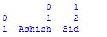
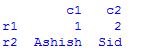
dataframe的创建是通过使用将多个系列传递到dataframe类中来完成的 警察局。系列 方法在这里,它被传递到两个系列对象中,s1作为第一行,s2作为第二行。 例子:
# assigning two series to s1 and s2 s1 = pd.Series([ 1 , 2 ]) s2 = pd.Series([ "Ashish" , "Sid" ]) # framing series objects into data df = pd.DataFrame([s1,s2]) # show the data frame df # data framing in another way # taking index and column values dframe = pd.DataFrame([[ 1 , 2 ],[ "Ashish" , "Sid" ]], index = [ "r1" , "r2" ], columns = [ "c1" , "c2" ]) dframe # framing in another way # dict-like container dframe = pd.DataFrame({ "c1" : [ 1 , "Ashish" ], "c2" : [ 2 , "Sid" ]}) dframe |
输出:

使用熊猫导入数据
第一步是读取数据。数据存储为逗号分隔的值或csv文件,其中每行用新行分隔,每列用逗号(,)分隔。为了能够使用Python中的数据,需要将csv文件读入数据帧。数据框是一种表示和处理表格数据的方法。表格数据有行和列,就像这样 csv文件 (点击下载)。 例子:
# Import the pandas library, renamed as pd import pandas as pd # Read IND_data.csv into a DataFrame, assigned to df df = pd.read_csv( "IND_data.csv" ) # Prints the first 5 rows of a DataFrame as default df.head() # Prints no. of rows and columns of a DataFrame df.shape |
输出:

29,10
使用熊猫索引数据帧
可以使用 熊猫。数据帧。伊洛克 方法iloc方法允许按位置检索多达行和列。 例如:
# prints first 5 rows and every column which replicates df.head() df.iloc[ 0 : 5 ,:] # prints entire rows and columns df.iloc[:,:] # prints from 5th rows and first 5 columns df.iloc[ 5 :,: 5 ] |
在熊猫中使用标签索引
可以使用 熊猫。数据帧。loc 方法,该方法允许使用标签而不是位置进行索引。 例如:
# prints first five rows including 5th index and every columns of df df.loc[ 0 : 5 ,:] # prints from 5th rows onwards and entire columns df = df.loc[ 5 :,:] |
以上内容与df看起来并没有太大区别。iloc[0:5,:]。这是因为虽然行标签可以采用任何值,但我们的行标签与位置完全匹配。但在处理数据时,列标签可以让事情变得容易得多。例子:
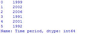
# Prints the first 5 rows of Time period # value df.loc[: 5 , "Time period" ] |
熊猫数据框数学
数据帧的计算可以通过使用工具的统计功能来完成。 例如:
# computes various summary statistics, excluding NaN values df.describe() # for computing correlations df.corr() # computes numerical data ranks df.rank() |


熊猫密谋
这些示例中的绘图是使用标准约定进行的,用于引用matplotlib API,该API提供了pandas中的基础知识,可以轻松创建外观良好的绘图。 例如:
# import the required module import matplotlib.pyplot as plt # plot a histogram df[ 'Observation Value' ].hist(bins = 10 ) # shows presence of a lot of outliers/extreme values df.boxplot(column = 'Observation Value' , by = 'Time period' ) # plotting points as a scatter plot x = df[ "Observation Value" ] y = df[ "Time period" ] plt.scatter(x, y, label = "stars" , color = "m" , marker = "*" , s = 30 ) # x-axis label plt.xlabel( 'Observation Value' ) # frequency label plt.ylabel( 'Time period' ) # function to show the plot plt.show() |


参考:
本文由 阿夫扎勒·萨安 .如果你喜欢GeekSforgek,并想贡献自己的力量,你也可以使用 贡献极客。组织 或者把你的文章寄到contribute@geeksforgeeks.org.看到你的文章出现在Geeksforgeks主页上,并帮助其他极客。
如果您发现任何不正确的地方,或者您想分享有关上述主题的更多信息,请写下评论。

![关于”PostgreSQL错误:关系[表]不存在“问题的原因和解决方案-yiteyi-C++库](https://www.yiteyi.com/wp-content/themes/zibll/img/thumbnail.svg)